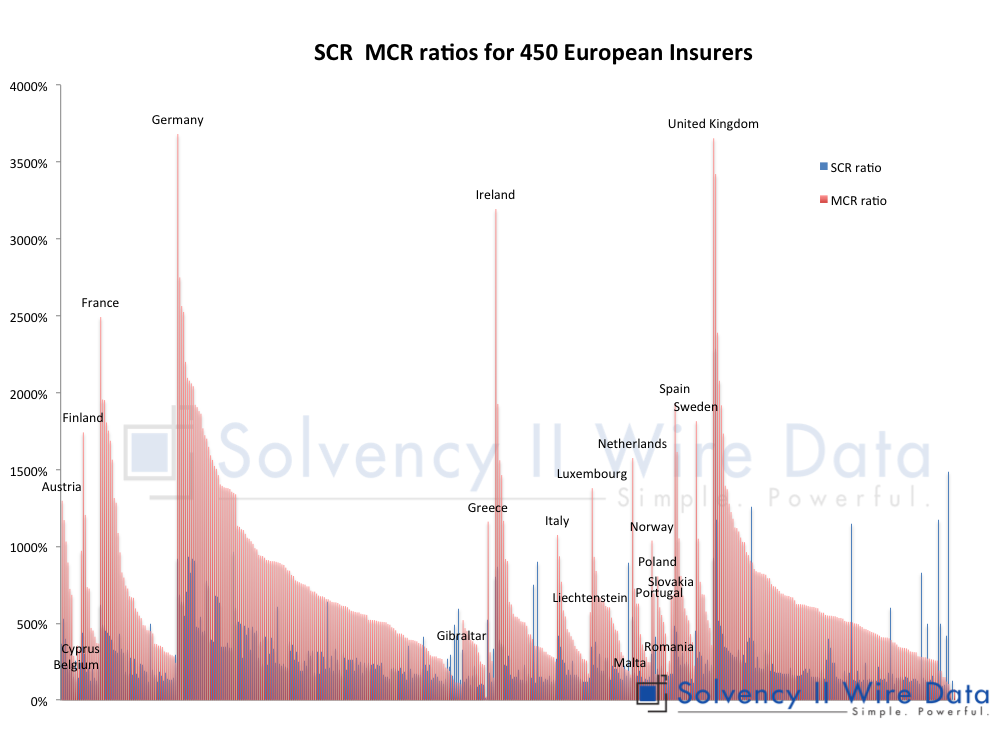
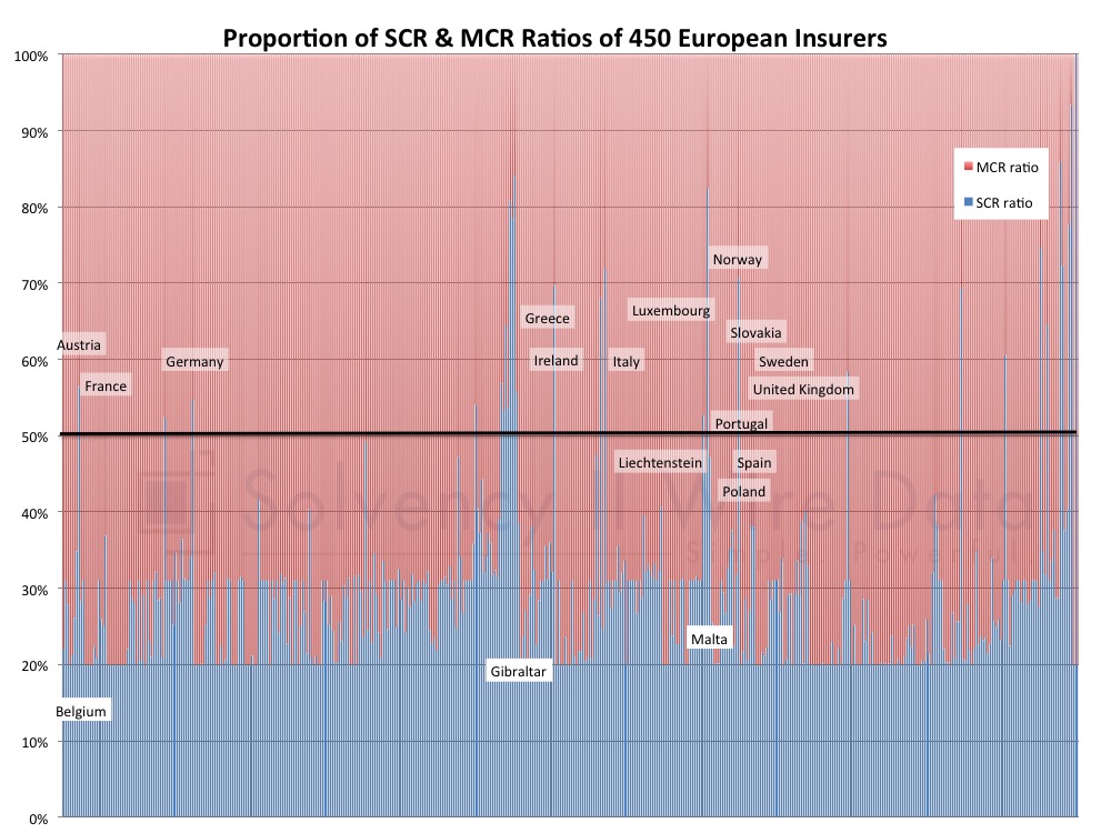
The following charts shows the SCR and MCR ratios of c.450 European insurers.
The chart lists ratios for companies in each country in the sample. The data within each country is sorted by MCR ratio size.
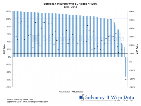
The following chart shows the relationship of the size of the SCR and MCR ratios of each company. Instances where the SCR ratio is higher than the MCR ratio are noted by the blue lines breaching the 50% mark (black line).
The full data set is available on the premium Solvency II Wire Data service. A subset of the data is also available to free subscribers to the service (register here).
Working with SFCRs and QRTs on Solvency II Wire Data
Home » Opinion » An emerging picture of Solvency II coverage ratios across Europe